Old Bakery & Emporium
eCommerce Gift Shop Web Design
Team:
1 Designer (individual project)
Duration:
2 weeks
My Role:
Stakeholder Interview
User and competitive research
Information Architecture (of 100 items)
Create low-fidelity wireframes
Usability testing
Project Overview:
The Old Bakery & Emporium is a historical building in downtown Austin that serves as a gift shop, a visitor center, and an art gallery. Since Old Bakery & Emporium currently doesn’t have a website, the business would like to reach more people by selling its products online. This was 2 weeks spec project.
On-site Visit
I visited Old Bakery & Emporium and talked to the people who work there to gather some background information about the business:
The Old Bakery & Emporium was a bakery since 1876 to 1936. Now it serves as a gift shop, a visitor center, and an art gallery that organized monthly art events.
The business works with 100+ local and national vendors who occasionally sell their products to the Old Bakery & Emporium.
A lot of the people who visit the store are from outside the U.S.
Part of the business profit goes to the Austin Parks & Recreation Department.
User Research Findings
I interviewed 7 people about their online shopping experience (4 females and 3 males), and here were some of the things I found:
People generally have a positive online shopping experience. They are able to find things that they’re looking for within 30 minutes.
People always look at “Rating”, “Price”, and “Comment”.
3 people said they’re more willing to purchase a product if there’s a story behind it.
Some back end problems people face include: “Shipping takes too long”, “Shopping cart expires within 30 minutes,” “The process of shipping back and forth (return) takes forever”.
Competitive Analysis
I compared The University Co-Op and the Texas State Capitol Gift Shop on their features and services they offer. I found that not all of them show product rating or product review. Texas State Capitol Gift Shop supports international shipping while The University Co-op only does domestic shipping.
SWOT Analysis of Old Bakery & Emporium
Although the Old Bakery & Emporium currently doesn't have a website and is competing with a number of local gift shops, it also has its unique strengths that stand out. The building itself is not only a historical site, but the interior space supports local artists' works that can't be found anywhere else. How to let more people know about the business is the key to build up the gift shop's reputation.
Persona & Customer Journey
Solution
Old Bakery & Emporium wants to sell its products online so not only more people can see what the business offers, but also the uniqueness and story behind the historical building.
The website will feature products that match current music festivals in town (ACL, SXSW, Blues on the Green, etc). It will also show critical features like customer rating and comments so customer can read and compare.
There will be an “Artist Story” section on the product page so people can read the story behind the scene.
Ideation
User Flow
Users come to the website to look for souvenirs or products that they want to buy. They can check out the featured items on the home page or go deeper into categories for specific items. After checking out the product that they like, users will proceed to check out.
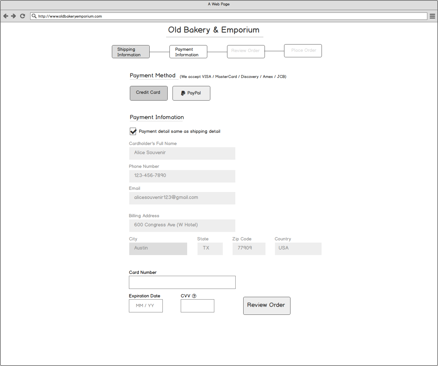
After comparing competitors such as Amazon and Nordstrom, I started sketching some ideas down from the homepage to the checkout page. The goal is to give users an easy-to-navigate platform to shop for souvenirs.
Since people have generally have a positive online shopping experience, I tried to stick my design to the current eCommerce websites’ layout to maintain consistency and expectation.
Initial Sketches
Usability Testing Findings
Homepage:
Users said they had hard time trying to locate the category, and they also expected to see some featured items on the home page. So I decreased the number of categories and added several featured souvenirs after the hero image.
Filter:
Users would like to see the price and category filters expanded, and they were confused about the "Rating" filter as well.
Most people said they would just sort by ratings instead of looking for a rating filter.
So I expanded and listed out the sub-categories, and made the price filter into a slide style where users can decide the minimum and maximum of their budget range.
Thank you page:
Users expected to see some calls-to-action choices after they made the purchase. So I added 2 options:
1) Users can create accounts there (if they are not a member)
2) Created a "back to homepage” link so users can browse other products or learn more about the business.
Key Screens
Conclusion
My design is to create an easy-to-navigate and information rich website for the Old Bakery & Emporium. While having both the user goal and the business goal in mind, the website is an eCommerce souvenir platform that tells the story of the building and the locals. I believe by adding stories to the website will allow the business to stand out as a competitive advantage.
Reflecting back the project, I realized how important user testing is as to information architecture. The word choice, design, and layout all seemed obvious until I started designing the website. Not only the project has helped me hone my skill in organizing information, but also the process of wireframing has given me an opportunity to learn to pay attention to detail.
View Additional Case Studies


